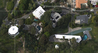
Harpel is located a few miles west of the Jacobsen House, just down Mulholland and on the opposite side about a block. From the road, there is a long driveway that goes uphill to a level pad where the house sits. You can get a pretty clear picture of the siting of the house from the Google Satellite view:
The Harpel House is the white bar at the lower right. The octagon to the left is Lautner's famous Chemosphere, aka the Malin House. The small white circle just below the Harpel House is a Futuro which is apparently being restored by the Harpel's owner.
We weren't allowed to photograph inside the house, so I'll give an exterior tour and describe a few things I liked about the inside, using the floor plan for visuals.
Here's an overall view of the house, with the Futuro visible just above and behind it on the hillside:
Lautner's floor plan, which was provided in our tour brochure, shows the main concept of the house pretty clearly. The structural system is a simple post-and-beam grid based on an equilateral triangle. (Properly speaking, it's not a grid but a tessellation.) The columns are all smooth concrete, and the beams linking them are wood. The entire north- and view-facing side of the house (towards the top in the drawing) is glass, while the opposite side is generally more solid. Click on the plan to embiggen.
Without being a total expert on Lautner, I'll go out on a limb and suggest that the house has qualities that relate it to Mies's Farnsworth House of 1945-51 or Johnson's 1949 Glass House. (I'm sure I've made some enemies with that statement but so be it. Go ahead and unfriend me.) Of course there are major differences, and this house is not at all the literal rectangular glass box that those two are. I find it much more nuanced than those two, although I have to disclaim that I haven't seen those houses in person.
As you approach from the road below and walk up the driveway, you have to go around and past the carport (on the left side of the plan above) to get to the courtyard and front door in the back of the house. As you pass around the carport end of the house, you can look up and see the Chemosphere above you to the west. Apparently Lautner met Malin through Harpel. I love that each house is visible from the other.
These show the carport and entry courtyard:
I really love the living room of this house. The entry/living/dining rooms together make up a large hexagonal shape at the east end of the house. Here is where Lautner's expressive design genius really shines. These spaces are so free, dynamic, and open that they provide a perfect counterpoint to the geometric rigor of the structural system.
At the center of this area is a column, which, as you can observe in the plan above, anchors a hexagonal spiral that works its way counter-clockwise, all the way back around to the kitchen at the upper left. Between the Living Room and Loggia (aka the entryway) is a low cabinet-wall on the Loggia side, with a built-in chevron-shaped upholstered seating unit (seems weirdly pedestrian to call it a couch) backing up to it on the Living Room side. Also, the living room is sunken a few steps from the rest of the house, giving it a higher ceiling that really makes its spatial proportions exquisite.
Along the south wall of the living room is the massive stone fireplace. The fireplace really makes the space (if not the whole house) for me. Its stone walls rise all the way to the ceiling, providing a palpable sense of shelter and enclosure, in stark contrast to the floor-to-ceiling glass walls opposite. In that aspect, this space reminded me a lot of the Schindler House on Kings Road, with its spatial contrast of concrete shelter on one side of the room, versus openness on the opposite side.
The other thing I really liked about that fireplace was the way its overall shape in plan is a shallow 'U' shape, with the side 'arms' of the shape opening outward.
This outward-gesturing shape, combined with the massiveness and extra height of the stone wall (because of the Living Room being sunken), served strongly to anchor and direct the orientation of the whole space outward towards the view.
In summary, I saw a few important similarities between this house and Jacobsen.
- Both demonstrate the importance to Lautner of having the exposed structural system play a major role in the architectural experience.
- Both houses explore and play on a combination of hexagonal and rectilinear geometries. In Jacobsen, the rectilinear dominates; in Harpel, the hexagonal dominates.
- Both utilize massive masonry fireplaces as devices to organize and focus the main living space. In each, the fireplace area has buit-in seating, and the composition of fireplace and seating together serves to orient the whole room to the view, while also allowing inhabitants to turn inward and enjoy the fire.


No comments:
Post a Comment